Colour Management for Large Format Printing: A UK Designer's Guide
Why Colour Management Matters in Large Format Printing
There's nothing more frustrating than approving a design on screen, only to receive a finished banner or display print where the colours look completely different. For UK businesses investing in large format printing — whether for retail signage, exhibition stands, or outdoor banners — colour accuracy isn't just an aesthetic concern; it directly affects brand credibility and customer perception.
At PRiNT BiG UK, we work with designers and marketing teams across the country every day, and colour management is one of the most common challenges we help clients navigate. This guide breaks down everything you need to know to achieve consistent, vibrant, print-ready results.
Understanding Colour Modes: RGB vs CMYK
The first step in effective colour management for large format printing is understanding the fundamental difference between screen colours and print colours.
- RGB (Red, Green, Blue) is the colour model used by screens — monitors, phones, and tablets. It's an additive model, meaning colours are created by combining light. RGB can display a very wide gamut of vivid colours.
- CMYK (Cyan, Magenta, Yellow, Key/Black) is the colour model used in printing. It's a subtractive model, where inks are layered on a substrate to absorb light. The printable colour gamut is narrower than RGB.
When you design in RGB and send a file directly to a large format printer without converting to CMYK, the printer's RIP (Raster Image Processor) software will perform an automatic conversion — and the results can be unpredictable. Bright neons, electric blues, and vivid greens are particularly prone to shifting. Always convert your artwork to CMYK before submitting for print-ready artwork UK production.
What About Pantone Colours?
Many UK brands use Pantone (PMS) colours to ensure consistency across all printed materials. While large format inkjet printers cannot reproduce Pantone inks directly, a skilled print provider like PRiNT BiG UK can use colour profiling to get as close as possible to your target Pantone values. Always provide your Pantone references alongside your CMYK file so we can calibrate accordingly.
Setting Up the Right Colour Profile
A colour profile (also called an ICC profile) is a standardised file that describes how a specific device — your monitor, your printer, or a scanner — reproduces colour. Using the correct colour profiles throughout your workflow is the cornerstone of accurate colour profile printing UK results.
Recommended Profiles for Large Format Print
- ISOcoated_v2_eci.icc — The industry standard for coated paper and many vinyl substrates. Widely used across European print production.
- GRACoL 2006 Coated1v2 — Common in North American workflows but increasingly used in the UK for premium print jobs.
- Custom printer profiles — At PRiNT BiG UK, we maintain calibrated ICC profiles for each of our large format printers and substrates. Ask us for the relevant profile when setting up your artwork.
In Adobe Illustrator or InDesign, go to Edit > Colour Settings and select the appropriate working space. When exporting to PDF, embed the colour profile to ensure the receiving printer can interpret your colours correctly.
Monitor Calibration: The Often-Overlooked Step
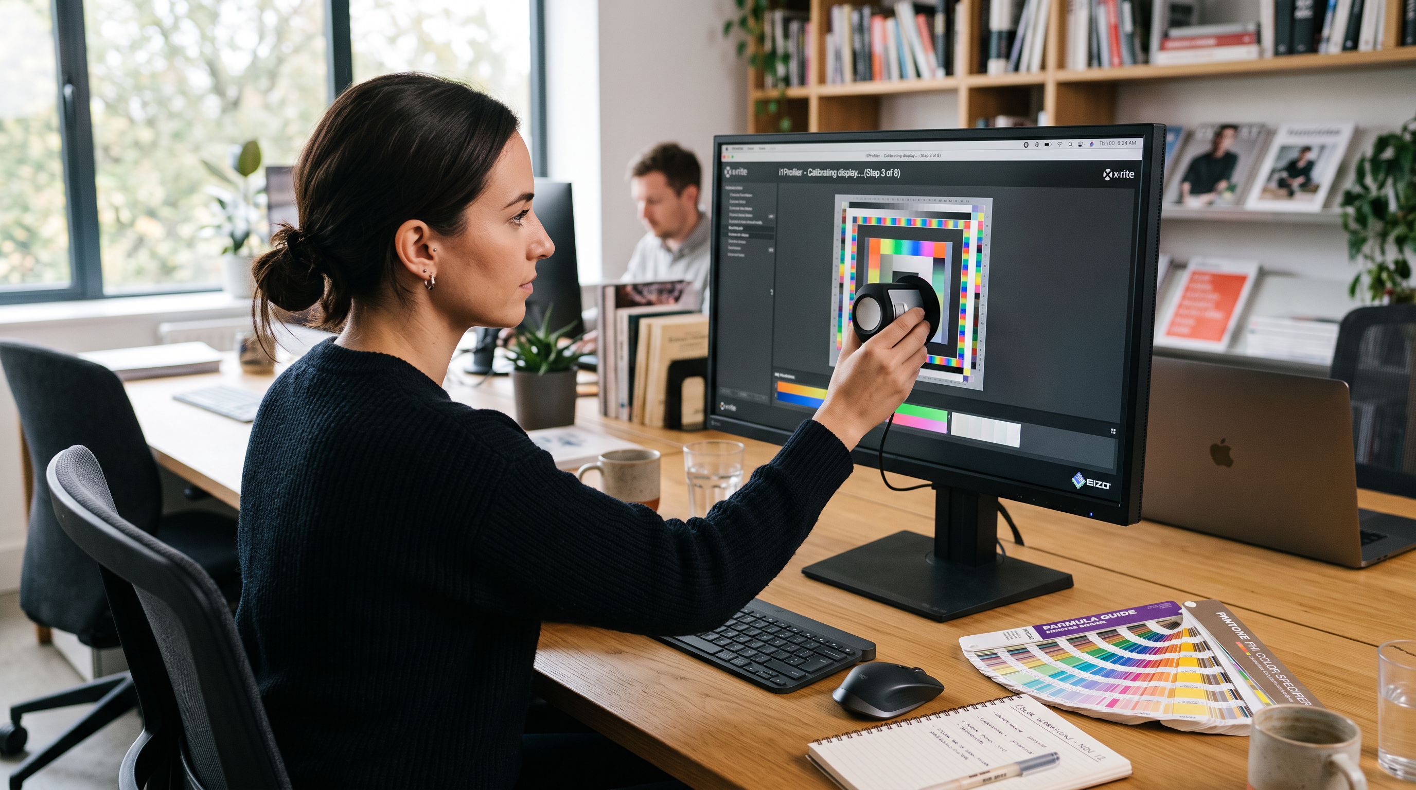
Even with perfect file settings, if your monitor isn't calibrated, you're essentially designing blind. A monitor that displays colours too brightly or with a warm colour cast will lead you to make compensations in your artwork that produce incorrect results in print.
For UK designers working on large format print colour accuracy, we recommend:
- Using a hardware colorimeter (such as the X-Rite i1Display or Datacolor Spyder) to calibrate your monitor at least once a month.
- Setting your monitor's white point to D65 (6500K) — the standard for print-oriented colour work.
- Working in a room with controlled, neutral lighting. Avoid designing next to a window with strong sunlight, as this affects colour perception significantly — particularly relevant during long UK summer days.
- Targeting a monitor luminance of around 120 cd/m² for print work (screens are often set much brighter by default).
These steps alone can dramatically reduce the gap between what you see on screen and what comes off the press.
Preparing Print-Ready Artwork: A Practical Checklist
Before submitting your files to any large format printer, run through this checklist to ensure your artwork is truly print-ready:
- ✅ Colour mode: Convert all elements to CMYK. Check for any remaining RGB images embedded in your document.
- ✅ Resolution: For large format, 100–150 dpi at final print size is typically sufficient (unlike small format, which requires 300 dpi). Very large prints viewed from a distance can work at 72 dpi.
- ✅ Bleed: Add at least 3mm bleed on all sides (5mm for larger banners). This prevents white edges appearing after trimming.
- ✅ Black settings: For large areas of black, use a rich black mix (C:60 M:40 Y:40 K:100) rather than K:100 alone, which can appear flat on large format prints.
- ✅ Fonts: Outline all fonts or embed them in your PDF to prevent substitution issues.
- ✅ File format: PDF/X-1a or PDF/X-4 are the preferred formats for professional large format print submission in the UK.
- ✅ Overprint settings: Check that overprint is not accidentally enabled on white or light elements, which can cause them to disappear in print.
Requesting a Proof Before Full Production
For high-value or brand-critical print jobs, always request a physical proof before committing to a full print run. At PRiNT BiG UK, we offer hard-copy proofing on the actual substrate your job will be printed on — giving you a true representation of the final colour output.
Soft proofing (viewing a simulated print preview on a calibrated monitor) is a useful intermediate step, but nothing replaces holding the actual printed material under real-world lighting conditions. This is especially important for retail signage in London and other UK cities, where lighting environments vary enormously between shop windows, exhibition halls, and outdoor settings.
Get Expert Colour Support from PRiNT BiG UK
Colour management doesn't have to be a source of stress. With the right workflow, the right profiles, and a trusted print partner, you can achieve stunning, accurate results that truly represent your brand.
PRiNT BiG UK offers free pre-flight artwork checks with every order, ensuring your files are colour-correct and print-ready before we go to press. Our team of large format specialists is on hand to advise on colour profiles, substrate choices, and file preparation — so your finished prints look exactly as you intended.
Ready to get started? Upload your artwork or request a quote today at PRiNT BiG UK and let our experts handle the colour science, so you can focus on the creative.
Tags:
Related Articles
Digital vs Traditional Large Format Printing: Which Is Right for Your UK Business?
Choosing between digital and traditional large format printing can be confusing. This guide breaks down the key differences, costs, quality considerations, and ideal use cases to help UK businesses make the right decision for their next print project.
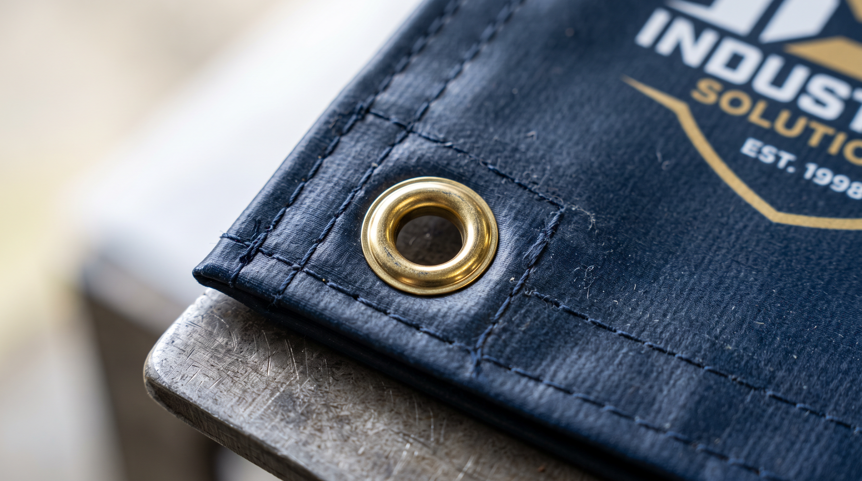
Print Finishing Options for Large Format Banners UK: Eyelets, Pole Pockets & Hemming Explained
Choosing the right finishing for your large format banner can make or break your display. From eyelets and pole pockets to hemmed edges and bungee loops, this guide explains every option so UK businesses can order with confidence.